


5 Pantone Colors to Avoid on Screen Printed Shirts
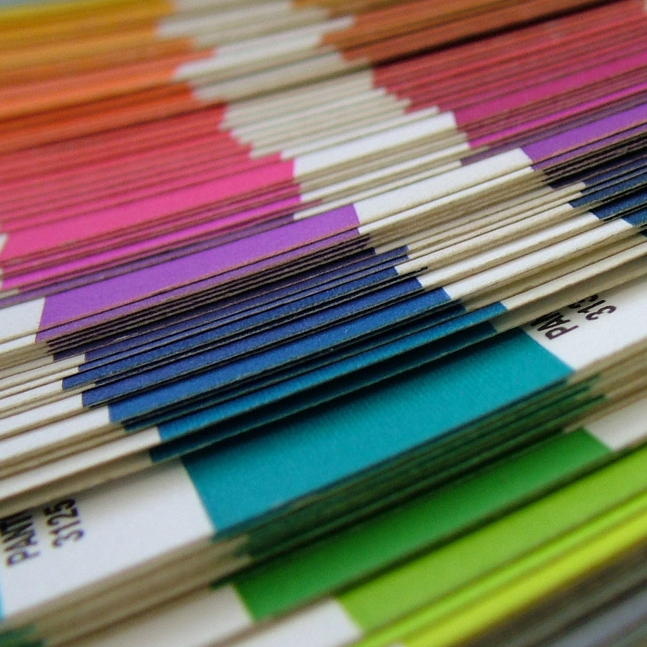
Pantone® colors are invaluable tools in most graphics related fields. However, when it comes to screen printing on dark t-shirts and other textiles, some Pantone® colors don’t print precisely like the chip or fan book. The following is a list of 5 colors to avoid if at all possible because you may not get what you expect.
1. Royal Blue 286 C is one of the most frequently requested colors around.
It really lightens up when printing on an under base. Instead of 286 C, we recommend printing a special formula called Super Opaque Royal. While 286 C prints up to 2 shades lighter with uneven coverage, Super Opaque Royal holds a steady tone in between 285 C and 286 C in your Pantone® book.
2. Reflex Blue C is another hugely popular royal color.
In cases where Reflex Blue C is called out, but not part of brand identity, we recommend printing a shade up – Blue 280 C. The 280 C ink will lighten up a little getting closer to Reflex Blue C than the actual Reflex formula on a white under base.
3. Process colors are cyan, magenta, yellow and black.
These inks were developed to print photographic images on t-shirts just like an office or home printer, prints on paper. The 4 color process for printing relies on blending colors, so these inks were developed to be highly transparent. Substitute these inks for another color in your Pantone® book that a higher percentage of trans white. For example, Yellow 102 C is 50 percent trans white. While it is a little lighter than process yellow, it is a more reliable print option. Instead of magenta, you may want to consider Rubine Red C. We’ve developed an process cyan for under base printing because of demand. It’s not exactly the same shade as cyan in the book, but a great alternative.
4. Fluorescent inks (801 C – 814 C) are entirely transparent.
Super bright colors, in general, are near impossible to translate from a design to a screen printed t-shirt. For the most reliable printing, consider a white shirt or create the design using bright colors that have over 50% trans white in the formula listing. A good example of this is Green 381 C.
5. Red 186 C is a nice true red, but it also tends to lighten up on an under base.
You may want to bump up your selection of reds in this area so the darker shade will print lighter getting you closer to your desired Pantone® color. For 185 C, print 186 C. For 186 C, print 187 C.
If exact Pantone® color matching is a must, be sure to consult with a screen print insider or artist. They can help trouble shoot colors that may pose a problem and come up with solutions.